Evolving from PR to Integrated Marketing
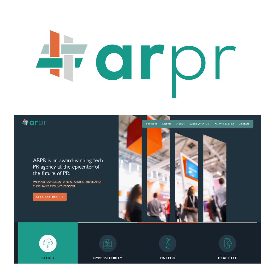
ARPR (Anna Ruth PR)—founded 10 years ago by one ambitious woman —had a mission to change the status quo of PR firms by integrating more measurable marketing services. Over the years, it evolved into an award-winning agency with expanded capabilities to solve big problems and provide transformative results for clients. However, the brand didn’t align with all the growth that had happened.
Client
Alloy
Year
2022
Services Rendered
Brand strategy, creative direction, project management, graphic design


The Need to Restart
A New Identity
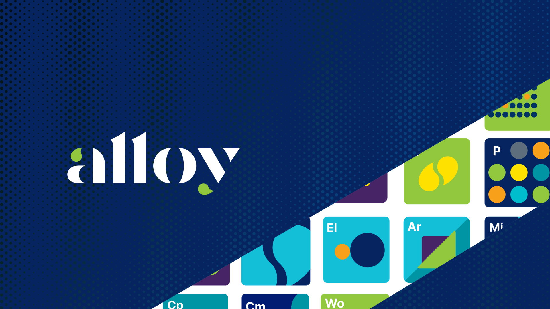
Alloy—defined as a metal made by combining two or more metallic elements to give greater strength to resistance or corrosion— serves as the perfect metaphor for what the company represents: integrated marketing for global tech brands. With this new name, the company has more room for growth as they expand their capabilities, clientelle and partnerships to the global market.

Innovative Visual Expression
As a play on the chemical alloy process, the company’s integrated marketing services are represented as elements in a metaphoric periodic table. Each capability is visualized as its own unique icon. For example, Cm stands for Content Marketing, Lg = Lead Generation, P = Personas, Ms=Media & Speaker Training, and so on…
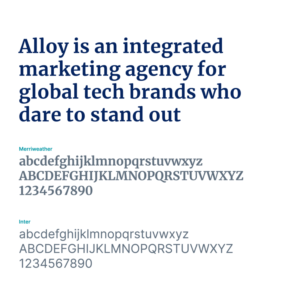
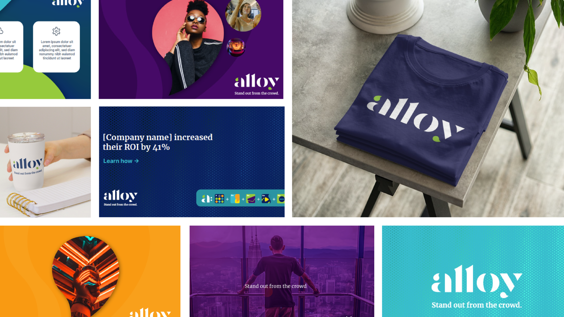
These clever visualizations, combined with a refined graphic/photographic style, expressive typography, and a flexible color palette, add greater depth to the new perception created. The result was a new name, logo, foundational messaging, visual identity, website (by Punch), updated marketing collateral, internal swag, and comprehensive brand guidelines.


View more case studies
© 2022-23 Brand Restart, a division of SW Graphic Design, LLC. All rights reserved.
